

Choosing between Balanced Beige vs Accessible Beige is one of the most common paint dilemmas homeowners face when working with warm neutral paint colors. Both shades from Sherwin-Williams are incredibly popular, and both promise a calm, comfortable interior.
Yet, once the paint actually hits the wall, many people are shocked to discover they don’t look the same at all. Lighting, flooring, natural undertones, and surroundings can make one shade perfect — and the other completely wrong.
Many homeowners expect beige to be “safe,” but beige has become more complex in modern design. Today’s neutrals need to work with gray furniture, warm flooring, creamy trim, natural wood, and black fixtures.
This is exactly why the Sherwin-Williams beige comparison between Balanced Beige and Accessible Beige has become so important. These colors look similar on a paint chip, but in real rooms, they behave very differently.
Balanced Beige tends to lean warmer, richer, and slightly deeper, while Accessible Beige reads softer, lighter, and more muted. If you pick the wrong one, a cozy room can suddenly feel heavy — or a bright space can turn flat and washed out.
That’s why understanding undertones, LRV, room orientation, décor style, and lighting truly matters before committing to gallons of paint.
In this guide you’ll learn:
- which color is lighter vs darker
- true undertones of each shade
- how both colors behave in different lighting
- the best rooms for each color
- interior styles they match
- coordinating trim, cabinet, and accent colors
- pros and cons of each
By the end, you’ll confidently know which beige belongs in YOUR home, not just which one looks pretty online.
Understanding Balanced Beige and Accessible Beige at a Glance
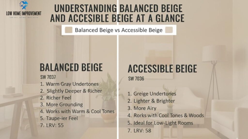
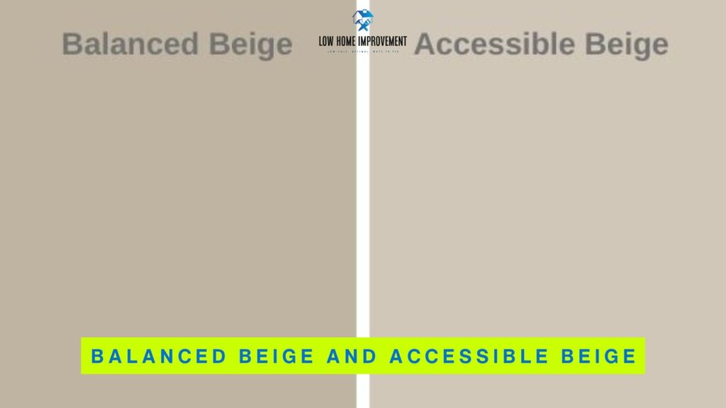
Both colors belong to the warm neutral paint family, yet they sit in different places on the beige–greige spectrum. Balanced Beige leans toward classic beige, while Accessible Beige leans toward soft greige-beige hybrid. Neither reads yellow or orange like traditional builder beige, which is why both have become designer favorites.
When viewed side-by-side, Accessible Beige immediately appears lighter and more modern, while Balanced Beige feels richer and slightly more traditional. The depth and undertones create two very different moods. Balanced Beige helps add coziness where rooms feel too open or empty. Accessible Beige helps brighten spaces without going stark white or cool gray.
Key homeowner takeaway:
They are not interchangeable. One works best for airy modern interiors; the other shines in cozy, grounded spaces.
What Is Balanced Beige (SW 7037)?
Balanced Beige (SW 7037) is a warm beige paint with subtle gray influence that keeps it from becoming orange or yellow. It sits comfortably in the middle depth range — not light, not dark. This makes it incredibly grounding on walls, especially in open floor plans or rooms with tall ceilings where pale colors get lost.
Balanced Beige has:
- warm beige base
- very soft taupe-gray undertones
- just enough depth to feel substantial
- no strong yellow cast
- a cozy, enveloping feel
This color shines in spaces where homeowners want warmth without the heaviness of brown. It pairs beautifully with earthy décor, darker wood tones, cream trim, stone fireplaces, and Tuscan or Mediterranean-inspired designs. It often reads darker than expected in low light because it absorbs more light than it reflects, creating a soft, cocoon-like effect.
Balanced Beige works best when:
- rooms already receive good natural light
- you want a cozy, comfortable atmosphere
- you prefer traditional, rustic, or farmhouse style
- your flooring is warm wood, tile, or stone
Avoid Balanced Beige if your room is small or dark — it might feel heavier than you’d like.
What Is Accessible Beige (SW 7036)?
Accessible Beige (SW 7036) is often described as a greige-beige hybrid, meaning it blends beige warmth with gray neutrality. It is lighter than Balanced Beige and more muted, which makes it incredibly versatile in modern interiors. Unlike old-fashioned beige, Accessible Beige rarely reads yellow, instead, it leans soft, airy, and slightly earthy.
Accessible Beige has:
- soft gray-beige base
- slight green undertone in cool light
- lighter, fresher feel than Balanced Beige
- modern neutrality without coldness
It is extremely popular in new builds, remodels, and staging homes for resale because it appeals to both warm and cool color lovers. The color adapts depending on surroundings, in bright sunlight, it will look more beige; in low light, it leans greige.
Accessible Beige works best when:
- you want a light, modern neutral
- your home has gray furniture, black hardware, or white trim
- your flooring is cool brown, gray-brown, or greige
- you want an updated but warm look
It’s ideal for homeowners who like beige warmth but dislike yellow or tan walls.
Balanced Beige vs Accessible Beige | Quick Overview
| Feature | Balanced Beige | Accessible Beige |
|---|---|---|
| Paint Code | SW 7037 | SW 7036 |
| Color Family | Warm Beige | Greige-Beige |
| Depth | Medium | Light-Medium |
| Undertone Temperature | Warm | Warm-neutral |
| Best Vibe | Cozy & grounded | Airy & modern |
| Ideal Lighting | Medium to bright | Low to bright |
| Best Style Match | Traditional | Modern / Transitional |
Balanced Beige vs Accessible Beige Undertones Explained
Undertones are also heavily influenced by everything already in the room. Flooring, countertops, furniture fabrics, and even surrounding landscaping visible through windows will change how each color appears. For example, warm orange-toned wood floors will push Balanced Beige even warmer, while gray tile or cool LED bulbs can pull Accessible Beige further toward greige.
This is why the same paint looks different in every house and even from wall to wall in the same room. When testing either shade, always place large sample swatches on multiple walls and review them morning, afternoon, and evening before making a final decision.
Balanced Beige and Accessible Beige share warm bases but behave very differently:
- Balanced Beige = taupe/beige warmth
- Accessible Beige = gray-beige with slight green
This is why one may clash or shift unexpectedly.
Balanced Beige Undertones
Balanced Beige also deepens slightly in low-light conditions, which is why it often feels richer in the evenings or in rooms with limited natural sunlight. In bright south-facing rooms, it softens beautifully without washing out, creating a warm, welcoming backdrop.
Because the undertone leans taupe rather than yellow, it feels sophisticated instead of “builder beige.” It works especially well with warm metals like bronze and brass, as well as natural textures such as wicker, linen, and wood beams. If you want a color that adds coziness without turning muddy or orange, Balanced Beige is one of the most reliable choices.
What you’ll see in rooms:
- warmer, richer wall color
- slight taupe depth in shadows
- warmth increases in south-facing light
- soft cozy glow at night
What you will NOT see:
- yellow-gold cast
- icy gray appearance
- pink or peach tones
Balanced Beige may read slightly muddier in dark rooms, making it better for brighter spaces.
Works beautifully with:
- travertine tile
- dark walnut furniture
- beige carpeting
- creamy trim colors
- archways, columns, and stone fireplaces
Accessible Beige Undertones
Accessible Beige contains gray-beige undertones with mild green shifting in cool light. That hint of green isn’t obvious but helps keep the color from turning yellow or peach the way many warm neutrals do.
What you’ll see in rooms:
- lighter, airy walls
- soft greige effect in shade
- subtle green cast in north-facing light
- neutral balance under LED light
What you will NOT see:
- strong yellow
- heavy brown
- orangey beige tones
Accessible Beige thrives in modern interiors where homeowners want warmth without cream or greige’s coolness.
Pairs well with:
- black hardware
- white oak floors
- gray furniture
- white trim
- modern light fixtures
Undertone Comparison by Lighting Type
| Lighting Type | Balanced Beige | Accessible Beige |
|---|---|---|
| Natural Light | Warm & grounded | Soft & neutral |
| LED Light | Rich beige | Slight greige |
| North-Facing | Cozy, deeper | Subtle green-greige |
| South-Facing | Warm & bright | Clean & airy |
| Evening Lamp Light | Very warm | Soft beige |
LRV Comparison | Which Paint Reflects More Light?
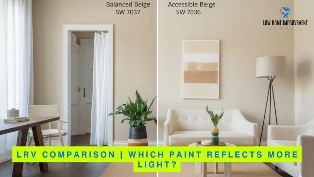
LRV (Light Reflectance Value) measures how much light a paint color reflects. Higher numbers = lighter color. This single number explains why one shade feels heavy and another feels open.
- Balanced Beige LRV ≈ 46
- Accessible Beige LRV ≈ 58
This means Accessible Beige reflects more light, making rooms feel larger and brighter.
See also How to Start Home Renovations HomeNumental
Balanced Beige LRV Performance
Balanced Beige’s LRV around 46 puts it solidly in the medium-depth zone. It absorbs light instead of bouncing it, which creates a cozy, cocooned feeling. In bright rooms, this is beautiful. In dark rooms, it may feel heavier than expected.
Balanced Beige is best when:
- room has lots of windows
- ceilings are high
- you want a warmer, richer look
- you dislike white or pale gray walls
Be careful in:
- hallways
- basements
- low-light bedrooms
It can read darker here.
Bullet takeaways:
- feels cozy, not bright
- can tone down huge open spaces
- creates intimate, relaxing atmosphere
- avoid in small windowless spaces
Accessible Beige LRV Performance
Accessible Beige reflects more light due to its LRV ~58. It is lighter, softer, and ideal for creating airy spaces without stark white. It keeps rooms from feeling cave-like while providing warmth absent in gray paint.
Best for:
- small rooms
- north-facing rooms
- hallways and stairwells
- homes with limited windows
It can wash out slightly in extremely bright rooms — but usually still looks elegant rather than stark.
Bullet takeaways:
- reflects significantly more light
- brightens dim rooms effectively
- safer in homes with heavy shade
- excellent for resale neutrality
LRV & Room Brightness Comparison
| Aspect | Balanced Beige | Accessible Beige |
|---|---|---|
| Light Reflectance | Medium | Higher |
| Small Rooms | ❌ Not ideal | ✅ Excellent |
| Large Open Concept | ✅ Cozy | ⚠️ Can wash out |
| North-Facing Rooms | Warm, darker | Balanced, slightly greige |
| Windowless Hallways | Heavy | Brighter |
Best Rooms for Balanced Beige and Accessible Beige
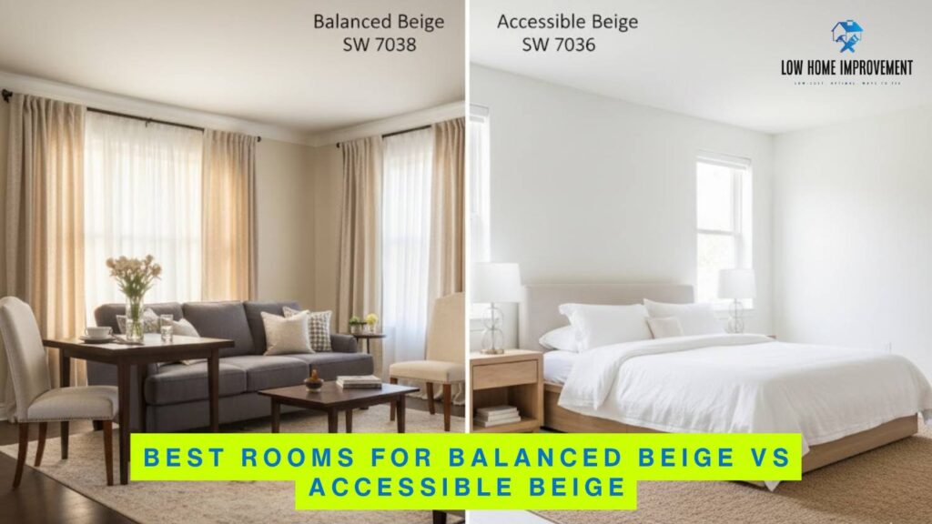
Choosing where to use Balanced Beige and Accessible Beige depends heavily on room size, natural light, ceiling height, and the overall feeling you want the space to have. Balanced Beige tends to make rooms feel cozy, grounded, and intimate. Accessible Beige instead feels open, airy, and calm. Neither is wrong — but each one shines in very different situations.
Balanced Beige works beautifully in rooms where you want warmth and visual weight. It’s excellent in bedrooms, dining rooms, formal living rooms, and dens. These are spaces where coziness feels intentional and inviting. Because Balanced Beige has a deeper tone, it helps large rooms feel less empty and brings walls visually inward without feeling dark brown or muddy.
Accessible Beige performs best in areas where brightness matters. It’s a great choice for hallways, kitchens, living rooms, stairwells, and open concept layouts. Because it reflects more light, it prevents smaller rooms from feeling boxed in. It is also extremely resale-friendly because it reads neutral and modern to most buyers.
Here is the simple rule to remember:
- if a room is dark or small, Accessible Beige wins
- if a room is large or echoey, Balanced Beige wins
Both can be used together in the same home to create subtle transitions between spaces without changing the general color story.
See also TTweakHotel Discount Codes
Best Room Applications
| Room | Better Choice | Reason |
|---|---|---|
| Living Room | Accessible Beige | Brighter, opens space visually |
| Bedroom | Balanced Beige | Cozy, relaxing warmth |
| Kitchen | Accessible Beige | Clean, modern feel with cabinetry |
| Bathroom | Accessible Beige | Prevents shadows and dullness |
| Dining Room | Balanced Beige | Adds depth and formality |
| Hallway | Accessible Beige | Light-reflective and open |
| Basement | Accessible Beige | Fights low-light heaviness |
Which Interior Styles Work Best with Each Color?
Interior design style matters more than most homeowners realize when picking between these two colors. Balanced Beige naturally complements traditional, rustic, Tuscan, Mediterranean, and farmhouse spaces because it echoes the warmth already present in wood and stone. Accessible Beige aligns with modern, Scandinavian, transitional, and contemporary interiors because it reads cleaner and more neutral.
Balanced Beige harmonizes beautifully with heavy wood furniture, leather sofas, stone fireplaces, and textured fabrics. It feels intentionally warm and classic. In spaces where archways, crown molding, or columns exist, Balanced Beige adds to the architectural character instead of fighting it. If your home feels like “cozy comfort,” Balanced Beige will usually look like it belongs there naturally.
Accessible Beige works best with sleek lines, minimalist spaces, white trim, black fixtures, and lighter wood flooring. It pairs well with gray sofas, quartz countertops, and modern lighting. It provides warmth without looking dated or golden, which is why it’s used frequently in remodels and resale staging. If your home feels airy, bright, and uncluttered, Accessible Beige fits effortlessly.
In short:
- Balanced Beige = worked-in warmth
- Accessible Beige = modern softness
Both are timeless neutrals when used in the right context instead of applied generically.
Interior Design Style Match
| Style | Balanced Beige | Accessible Beige |
|---|---|---|
| Modern | ❌ Not ideal | ✅ Best match |
| Farmhouse | ✅ Excellent | ⚠️ Works in light spaces |
| Transitional | ⚠️ Sometimes | ✅ Very strong |
| Rustic | ✅ Perfect fit | ❌ Often too light |
| Mediterranean | ✅ Strong match | ❌ May wash out |
| Scandinavian | ❌ Too warm | ✅ Ideal |
| Traditional | ✅ Excellent | ⚠️ Can look too soft |
Best Coordinating Colors for Balanced Beige & Accessible Beige
Coordinating colors determine whether your beige will look rich and sophisticated or flat and dirty. The right trim, cabinet, and accent shades completely change the character of both colors. Balanced Beige prefers warmer partners, while Accessible Beige loves clean whites and sharper contrasts.
Balanced Beige pairs beautifully with:
- Creamy SW 7012
- Natural Choice
- soft off-whites
- dark wood tones
- bronze and warm metals
Accessible Beige pairs better with:
- Alabaster SW 7008
- Pure White SW 7005
- black hardware
- gray stone
- white oak flooring
Accent colors make both shades feel intentional instead of “default beige.” Navy blue, sage green, charcoal gray, and black work extremely well as contrasts. They provide depth and keep neutral rooms from feeling boring or washed out.
If your trim is creamy, Balanced Beige will look more harmonious.
If your trim is crisp white, Accessible Beige will look more modern and fresh.
This is one of the biggest deciding factors most homeowners overlook.
Best Color Pairings
| Main Wall Color | Best Trim Color | Best Accent Color |
|---|---|---|
| Balanced Beige | Creamy | Deep wood tones |
| Balanced Beige | Natural Choice | Bronze / gold |
| Accessible Beige | Alabaster | Navy blue |
| Accessible Beige | Pure White | Black or charcoal |
| Both | High Reflective White | Natural oak |
Balanced Beige vs Accessible Beige | Pros and Cons
Every great neutral comes with trade-offs. Understanding strengths and weaknesses helps prevent disappointment after painting. Neither color is universally better — they are simply better for different types of homes and lighting conditions.
Balanced Beige Pros:
- warm and cozy
- hides dirt and scuffs well
- pairs beautifully with stone and wood
- excellent for large, open rooms
Balanced Beige Cons:
- can feel heavy in dark rooms
- looks muddy under cool LED lights
- not ideal for ultra-modern interiors
Accessible Beige Pros:
- lighter and brighter
- highly versatile greige-beige tone
- resale-friendly neutral
- works with both warm and cool décor
Accessible Beige Cons:
- can wash out in extremely bright rooms
- slight green undertone may appear in north light
- less effective at adding visual coziness
The correct choice is less about which one is “best” and more about:
- your lighting
- room size
- flooring tones
- interior style
See also Where Does Kirk Herbstreit Live
Pros and Cons Comparison
| Category | Balanced Beige | Accessible Beige |
|---|---|---|
| Overall Feel | Warm & cozy | Light & airy |
| Best Lighting | Medium–bright | Low–medium |
| Difficulty Level | Moderate | Very easy |
| Risk in Dark Rooms | High | Low |
| Works With Gray Decor | ⚠️ Sometimes | ✅ Yes |
| Works With Brown Decor | ✅ Yes | ⚠️ Sometimes |
Balanced Beige vs Accessible Beige | Which One Should You Choose?
Choosing your paint color should not feel like guessing. You can make a confident decision by evaluating just a few key elements in your home. Look first at your floors, then your lighting direction, then your trim color, and finally your design style.
Choose Balanced Beige if:
- you want warmth and coziness
- you have warm wood or tile floors
- your room receives plenty of sunlight
- your style leans traditional or rustic
- you dislike the look of gray walls
Choose Accessible Beige if:
- your rooms feel small or dark
- your trim is crisp white
- you have gray or greige flooring
- your style leans modern or transitional
- you want a safe resale color
The truth: many homes successfully use both colors together. For example:
- Accessible Beige in main living areas
- Balanced Beige in bedrooms or dining rooms
This creates natural variation without clashing undertones.
Final Decision Checklist
| Question | Best Choice |
|---|---|
| My room feels dark | Accessible Beige |
| My room feels big and empty | Balanced Beige |
| I have white trim | Accessible Beige |
| I have creamy trim | Balanced Beige |
| I like modern style | Accessible Beige |
| I like cozy traditional style | Balanced Beige |
Frequently Asked Questions
Is Balanced Beige warmer than Accessible Beige?
Yes, Balanced Beige is the warmer of the two. It leans more toward taupe-beige warmth, while Accessible Beige contains stronger gray influence. This makes Balanced Beige feel cozier and slightly more traditional in real spaces. Accessible Beige instead feels softer, lighter, and more neutral, especially in rooms with white trim or gray décor.
Which is lighter — Balanced Beige or Accessible Beige?
Accessible Beige is noticeably lighter because it has a higher LRV. If you have smaller rooms, hallways, or darker spaces, Accessible Beige will almost always perform better because it reflects more light. Balanced Beige will feel deeper and richer, which works beautifully in rooms that already have sunlight.
Is Accessible Beige considered greige?
Yes, Accessible Beige is best described as a greige-beige hybrid. It is not full beige, and it is not full gray. Instead, it lives in the neutral middle ground. This is one of the main reasons it has become a top seller — it blends warmth and modern neutrality without turning cold.
FAQ Quick Reference
| Question | Answer |
|---|---|
| Warmer Color | Balanced Beige |
| Lighter Color | Accessible Beige |
| Best for Dark Rooms | Accessible Beige |
| Best for Coziness | Balanced Beige |
| Greige-Based Shade | Accessible Beige |
| Beige-Based Shade | Balanced Beige |
Can you use Balanced Beige and Accessible Beige together?
Yes, and designers do this often. They work beautifully together because they share warmth but differ in depth. The most popular combination is Accessible Beige in main living areas and Balanced Beige in bedrooms or dining spaces. This creates subtle contrast while keeping the color palette cohesive throughout the home.
Is Balanced Beige too dark for small rooms?
Balanced Beige can be too dark in some small or windowless spaces. Because it has a medium depth and lower reflectance value, it absorbs light. In very small bedrooms, hallways, or basements, it may feel heavier than expected. If you want a similar tone but lighter effect, Accessible Beige is the safer choice.
Small Room Suitability
| Situation | Best Choice |
|---|---|
| Small room with no windows | Accessible Beige |
| Small room with good light | Either works |
| Basement | Accessible Beige |
| Large sunny bedroom | Balanced Beige |
| Open concept area | Accessible Beige |
Paint Pairing Guide with Flooring
| Flooring Type | Balanced Beige | Accessible Beige |
|---|---|---|
| Dark wood | ✅ Excellent | ⚠️ Depends on lighting |
| Light oak | ⚠️ Can look heavy | ✅ Perfect match |
| Gray wood | ❌ Not ideal | ✅ Excellent |
| Tile flooring | ✅ Works well | ⚠️ Depends on tone |
| Carpet | ✅ Cozy | ✅ Neutral |
Conclusion | Which One Is Right for You?
Choosing between Balanced Beige vs Accessible Beige ultimately comes down to lighting, room size, and the mood you want to create. Balanced Beige offers a deeper, grounded warmth with subtle gray undertones, making it ideal for spaces where you want a cozy, sophisticated feel. Accessible Beige, on the other hand, feels lighter and more adaptable, thanks to its gray-beige base and soft green undertones that keep it looking fresh in changing light.
Both shades are timeless neutrals that work beautifully across a wide range of interior styles. Whether you’re designing a calm, airy open-concept layout or a warm, inviting living space, understanding their undertones and light reflectance values will help you choose the beige that truly fits your home. Test each color in your lighting, observe how it shifts throughout the day, and you’ll confidently land on the perfect neutral backdrop.