

Swiss Coffee by Sherwin Williams is one of the most searched and debated off-white paint colors for homeowners, designers, and builders alike. If you’re looking for a white paint that feels warm, soft, and inviting without looking yellow or dull, Swiss Coffee often lands at the top of the list. It’s especially popular in modern farmhouse, transitional, and contemporary homes where a bright white can feel too stark.
What makes Swiss Coffee Sherwin Williams stand out is its creamy warmth combined with subtle depth. Unlike pure whites that reflect light aggressively, Swiss Coffee absorbs just enough warmth to feel comfortable while still keeping rooms bright and open. This balance makes it a versatile choice for walls, cabinets, trim, and even exterior applications when paired correctly.
However, Swiss Coffee isn’t a one-size-fits-all color. Lighting direction, flooring, surrounding finishes, and even paint sheen can dramatically change how it looks in real homes. In some spaces, it reads soft and elegant; in others, it may appear warmer than expected. That’s why understanding its undertones, comparisons, and best uses is critical before committing.
In this complete guide, you’ll learn:
- What Swiss Coffee Sherwin Williams really looks like
- How it compares to Alabaster, Creamy, and Benjamin Moore Swiss Coffee
- Undertones, lighting behavior, and color matching
- Best rooms, palettes, and finishes to use it confidently
What Is Swiss Coffee by Sherwin Williams?
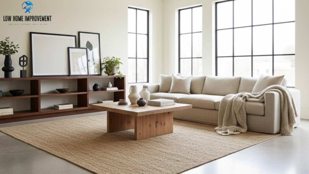
Swiss Coffee by Sherwin Williams is best described as a warm off-white paint color that sits comfortably between bright white and light beige. It is designed for homeowners who want a clean, neutral look without the cold or clinical feel that many pure whites can create. Swiss Coffee brings a subtle softness to interiors, making spaces feel more welcoming and lived-in while still appearing fresh and modern.
Unlike stark whites that can emphasize shadows and imperfections, Swiss Coffee gently diffuses light across a room. This makes it especially popular in homes with open floor plans, where consistent wall color flow is important. The color has enough warmth to complement wood tones, natural stone, and warm metals, which is why it’s often used in farmhouse, transitional, and traditional-style homes.
Swiss Coffee Sherwin Williams is commonly chosen for:
- Interior walls in living rooms and bedrooms
- Kitchen and bathroom walls where warmth is desired
- Cabinets and trim when paired with brighter whites
- Homes aiming for a timeless, resale-friendly palette
Because it isn’t a true white, Swiss Coffee tends to be more forgiving in rooms with mixed lighting conditions. It helps soften harsh daylight and reduces the stark contrast caused by bright LED lighting. That said, its undertones still matter, and understanding whether it reads warm or neutral in your specific space is essential before committing to it throughout your home.
Is Swiss Coffee a True White or an Off-White?
Swiss Coffee Sherwin Williams is not a true white—it is firmly in the off-white category. True whites typically have very high light reflectance values and minimal undertones, which can make them feel crisp but sometimes cold. Swiss Coffee, on the other hand, includes soft creamy undertones that give it warmth and depth.
This off-white nature allows Swiss Coffee to adapt better to real-life environments. In natural daylight, it often appears light and airy, while in evening or artificial lighting, it takes on a warmer, cozier tone. This is one reason many homeowners prefer it over bright whites, especially in family rooms and bedrooms where comfort matters more than sharp contrast.
Another key difference is how Swiss Coffee interacts with other finishes. True whites can clash with warm floors or cabinetry, while Swiss Coffee blends more naturally with oak, maple, and warm tile. If you’re aiming for a white that doesn’t feel stark or icy, Swiss Coffee offers a balanced alternative that still reads clean and neutral.
Why Swiss Coffee Is Popular for Modern Homes
Swiss Coffee has become increasingly popular in modern homes because it bridges the gap between contemporary brightness and traditional warmth. Modern interiors often rely on neutral color palettes, clean lines, and natural materials, and Swiss Coffee complements all of these elements without overpowering them.
One reason designers favor Swiss Coffee is its versatility. It works well in open-concept layouts where walls flow from one space to another, helping maintain visual consistency. It also pairs beautifully with modern materials like quartz countertops, matte black fixtures, brushed brass hardware, and light wood flooring.
Homeowners also appreciate Swiss Coffee for its livability. Bright whites can feel high-maintenance and show dirt, scuffs, and shadows more easily. Swiss Coffee’s subtle warmth helps hide minor imperfections, making it a practical choice for busy households.
In modern homes that prioritize comfort, warmth, and timeless appeal over stark minimalism, Swiss Coffee Sherwin Williams continues to be a go-to option that feels current without being trendy.
Swiss Coffee vs Traditional White Paint Colors
When compared to traditional white paint colors, Swiss Coffee stands out for its softness and depth. Traditional whites are often chosen for their crisp, clean appearance, but they can feel overly bright or cold, especially in rooms with limited natural light. Swiss Coffee offers a gentler alternative that still keeps spaces light without overwhelming them.
Traditional whites tend to reflect more light, which can amplify shadows and make rooms feel less cozy. Swiss Coffee absorbs light more evenly, creating a smoother visual experience across walls and ceilings. This makes it particularly appealing in bedrooms, living rooms, and older homes with varied lighting conditions.
However, if your goal is a high-contrast, ultra-modern look, a traditional white may be a better fit. Swiss Coffee excels when warmth, comfort, and versatility are priorities. Choosing between the two ultimately depends on your home’s lighting, finishes, and the atmosphere you want to create.
Swiss Coffee Sherwin Williams Color Code & Technical Details

Understanding the technical details behind Swiss Coffee Sherwin Williams is essential if you want predictable results in your home. While paint colors are often chosen emotionally, factors like color codes, light reflectance value (LRV), and digital color data play a major role in how the color actually appears on your walls. These details help explain why Swiss Coffee looks soft and bright in some rooms and warmer or deeper in others.
Swiss Coffee is engineered to sit in the off-white range, meaning it reflects a large amount of light without being stark. This makes it flexible for both small and large spaces. Knowing its technical makeup also helps when comparing it to similar whites, matching it across brands, or deciding whether it will work in low-light or high-light environments.
Homeowners often overlook these specifications, but designers rely on them heavily. By understanding Swiss Coffee’s color code, LRV, and digital values, you can better predict how it will behave in your specific lighting conditions and avoid surprises after painting.
Swiss Coffee Paint Color Sherwin Williams Code & Formula
Every Sherwin Williams paint color has a unique internal formula that determines how the color is mixed at the store. Swiss Coffee’s formula is carefully balanced to create a warm, creamy white without pushing too far into beige or yellow territory. While the exact tint formula can vary slightly by paint line, Sherwin Williams uses consistent base components to maintain color accuracy.
When requesting Swiss Coffee at a Sherwin Williams store, it’s important to specify the exact product line you’re using, such as Emerald, Duration, or SuperPaint. Different bases can slightly influence how the color appears once applied, especially in terms of depth and finish. This is why two samples of Swiss Coffee may look subtly different depending on the paint line chosen.
If you are trying to match Swiss Coffee across multiple rooms or surfaces, using the same paint line and sheen is highly recommended. Mixing lines can introduce small variations that become noticeable under different lighting conditions. For best results, always test a sample of Swiss Coffee using the exact product you plan to use for the full project.
Swiss Coffee LRV (Light Reflectance Value) Explained
The Light Reflectance Value, or LRV, measures how much light a paint color reflects on a scale from 0 (pure black) to 100 (pure white). Swiss Coffee Sherwin Williams falls into the high-LRV range, which means it reflects a significant amount of light and helps brighten spaces naturally.
Because Swiss Coffee has a slightly lower LRV than true whites, it reflects light more softly. This creates a warmer and less glaring effect, especially in rooms with strong natural light. In darker spaces, Swiss Coffee still helps brighten the room but without appearing harsh or washed out.
LRV becomes especially important in small rooms, hallways, and north-facing spaces. Swiss Coffee’s balance of light reflection and warmth allows it to perform well in these areas, making it a popular choice for homes that struggle with uneven lighting. However, in extremely bright rooms, its warmth may become more noticeable, which is something to consider when planning your color palette.
RGB and HEX Values Explained Simply
RGB and HEX values are digital representations of color commonly used in design software, visualizers, and online previews. Swiss Coffee Sherwin Williams has RGB values that lean toward higher red and green levels with slightly lower blue, which explains its warm, creamy appearance.
These values help designers predict undertones and understand how the color will translate across digital screens. However, it’s important to remember that RGB and HEX values are approximations. Paint reacts to real-world lighting, textures, and surrounding colors in ways that screens cannot fully replicate.
While these digital values are useful for planning mood boards or coordinating finishes, they should never replace physical samples. Swiss Coffee can appear lighter, darker, warmer, or cooler depending on lighting and surrounding materials, so testing remains essential before final application.
Swiss Coffee Sherwin Williams – Technical Overview Table
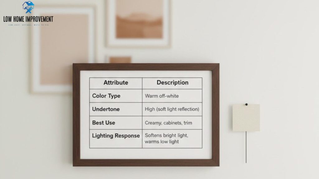
| Attribute | Description |
|---|---|
| Color Type | Warm off-white |
| LRV | High (soft light reflection) |
| Undertone | Creamy, warm |
| Best Use | Walls, cabinets, trim |
| Lighting Response | Softens bright light, warms low light |
Swiss Coffee Undertones Explained (Warm or Cool?)
One of the most common questions homeowners ask about Swiss Coffee Sherwin Williams is whether it is warm or cool—and the short answer is warm, but with nuance. Undertones are subtle background colors that influence how paint appears once it’s on your walls, and Swiss Coffee’s undertones play a major role in its popularity and versatility.
Swiss Coffee is known for its creamy warmth, which gives it a soft, inviting appearance. However, unlike overly yellow or beige whites, its undertones are restrained, allowing the color to remain neutral in many environments. This balance makes Swiss Coffee adaptable, but it also means that lighting, flooring, and surrounding finishes can significantly affect how those undertones show up.
Understanding Swiss Coffee’s undertones helps prevent common mistakes, such as pairing it with cool grays or placing it in lighting conditions that exaggerate warmth. When used correctly, Swiss Coffee feels cozy and timeless. When used incorrectly, it can lean warmer than expected.
Does Swiss Coffee Have Yellow Undertones?
Yes, Swiss Coffee Sherwin Williams does have subtle yellow undertones, but they are soft and muted rather than bold or golden. These undertones are what give the color its creamy appearance and help it avoid looking stark or icy. In most balanced lighting conditions, the yellow undertones are barely noticeable and instead read as warmth.
However, yellow undertones become more visible in rooms with warm artificial lighting, such as incandescent bulbs or warm LEDs. In these settings, Swiss Coffee can appear richer and slightly more yellow, especially on large wall surfaces. This effect is amplified when paired with warm woods, beige tiles, or brass fixtures.
In cooler or neutral lighting, the yellow undertones are less pronounced, allowing Swiss Coffee to appear closer to a soft white. This adaptability is one of the reasons Swiss Coffee is often recommended for whole-home color schemes, as it performs well across different spaces without dramatic shifts.
Creamy vs Beige vs Greige Undertones
Swiss Coffee sits firmly in the creamy undertone category rather than beige or greige. Creamy whites have warmth but lack the brown or gray depth found in beige and greige tones. This makes Swiss Coffee feel lighter and cleaner than beige-based off-whites while still offering warmth.
Beige undertones tend to show more brown or tan, which can make a color feel dated in modern interiors. Swiss Coffee avoids this by keeping its undertones light and subtle. Greige undertones, on the other hand, include gray, which Swiss Coffee does not prominently feature. This is why Swiss Coffee pairs better with warm palettes than cool gray ones.
If your home features warm wood floors, cream tiles, or earth-toned accents, Swiss Coffee blends seamlessly. In spaces dominated by cool grays or blue undertones, it may feel out of place unless carefully balanced with warmer accents.
How Undertones Change in Different Lighting
Lighting has a powerful influence on how Swiss Coffee’s undertones appear. In natural daylight, especially in south-facing rooms, the color often looks lighter and more neutral. The creamy undertones soften but don’t dominate, making the space feel bright and airy.
In low-light or north-facing rooms, Swiss Coffee’s warmth becomes more noticeable. The reduced natural light allows the creamy undertones to come forward, which can be an advantage if you want a cozy atmosphere. However, if you’re expecting a crisp white, this shift can be surprising.
Artificial lighting also plays a role. Warm lighting enhances Swiss Coffee’s creamy tones, while neutral or cool lighting helps keep it balanced. This is why testing the color under different lighting conditions is critical before committing to it throughout your home.
When Swiss Coffee Can Look Too Warm
Swiss Coffee can look too warm in certain situations, particularly when combined with multiple warm elements. Homes with yellow-toned lighting, warm beige flooring, and golden wood finishes may push Swiss Coffee into overly creamy territory.
It can also appear warmer on large wall expanses compared to trim or ceilings. Using a brighter white for trim can help offset this effect and create visual contrast. If you prefer a cleaner look, pairing Swiss Coffee with neutral lighting and cooler accents can help maintain balance.
Ultimately, Swiss Coffee’s warmth is its strength—but only when it’s thoughtfully paired with the right materials and lighting.
Swiss Coffee in Natural vs Artificial Lighting
Lighting is one of the most important factors influencing how Swiss Coffee Sherwin Williams appears in your home. Because Swiss Coffee is a warm off-white with creamy undertones, it reacts noticeably to changes in both natural and artificial light. The same paint color can look soft and neutral in one room and warmer or deeper in another, depending entirely on light direction and bulb temperature.
Many homeowners are surprised by how different Swiss Coffee looks from morning to evening. This isn’t a flaw in the color—it’s a characteristic of warm off-whites. Understanding how Swiss Coffee behaves in different lighting conditions helps you choose the right rooms for it and avoid disappointment after painting.
Swiss Coffee performs best when lighting is balanced. Extremely warm or extremely cool light can exaggerate undertones, while neutral lighting tends to showcase the color at its best. Below, we break down exactly how Swiss Coffee behaves in common lighting scenarios.
Swiss Coffee in North-Facing Rooms
North-facing rooms receive cooler, indirect natural light throughout the day. In these spaces, Swiss Coffee’s warm undertones become more noticeable because the cool light reduces brightness and emphasizes warmth. This can be a positive effect if you want to add coziness to a room that might otherwise feel cold or flat.
In north-facing living rooms and bedrooms, Swiss Coffee often appears slightly deeper and creamier than expected. This makes it ideal for creating an inviting atmosphere, especially when paired with warm furnishings, wood accents, or layered textiles. However, if your goal is a crisp, bright white, Swiss Coffee may feel too warm in these conditions.
To balance the look, consider:
- Using neutral or slightly cool LED lighting
- Pairing Swiss Coffee with lighter flooring
- Adding brighter white trim for contrast
When used thoughtfully, Swiss Coffee can soften the coolness of north-facing light without making the room feel dark.
Swiss Coffee in South-Facing Rooms
South-facing rooms receive abundant, warm natural light throughout the day, making them ideal for many white and off-white paint colors. In these rooms, Swiss Coffee often looks lighter, brighter, and more neutral. The strong natural light reduces the visibility of creamy undertones, allowing the color to read closer to a soft white.
This lighting condition is where Swiss Coffee truly shines. Living rooms, kitchens, and open-concept spaces with southern exposure benefit from its ability to stay bright without becoming harsh. The warmth feels intentional rather than overwhelming, creating a relaxed yet polished look.
In south-facing rooms, Swiss Coffee pairs beautifully with:
- White or light oak cabinetry
- Quartz or marble countertops
- Matte black or brushed brass fixtures
If your home has ample natural light, Swiss Coffee is a safe and versatile choice that delivers consistent results.
Swiss Coffee Under LED vs Incandescent Lighting
Artificial lighting can dramatically alter how Swiss Coffee appears, especially in the evening. Warm incandescent bulbs enhance Swiss Coffee’s creamy undertones, making it appear richer and warmer. This can be ideal for cozy spaces like bedrooms and dining rooms but may feel too yellow in kitchens or bathrooms.
LED lighting varies widely. Warm LEDs (2700K–3000K) mimic incandescent light and emphasize warmth, while neutral LEDs (3500K–4000K) help balance Swiss Coffee and keep it from looking too creamy. Cool LEDs (5000K+) can make the color feel flatter and slightly dull.
For the best results:
- Use neutral LEDs in kitchens and workspaces
- Use warm lighting intentionally in cozy rooms
- Test lighting at night before finalizing the color
Swiss Coffee’s flexibility is an advantage, but lighting choice determines whether it feels elegant or overly warm.
Swiss Coffee Throughout the Day: Morning vs Evening
Swiss Coffee changes subtly throughout the day as natural light shifts. In the morning, it often appears brighter and fresher, especially in rooms with eastern exposure. By evening, as artificial lighting takes over, the color deepens and feels warmer.
This natural shift is why Swiss Coffee works well in lived-in homes. It adapts to daily rhythms and creates different moods without changing color. However, this also reinforces the importance of testing the paint in your space across multiple times of day.
Swiss Coffee Lighting Behavior Summary
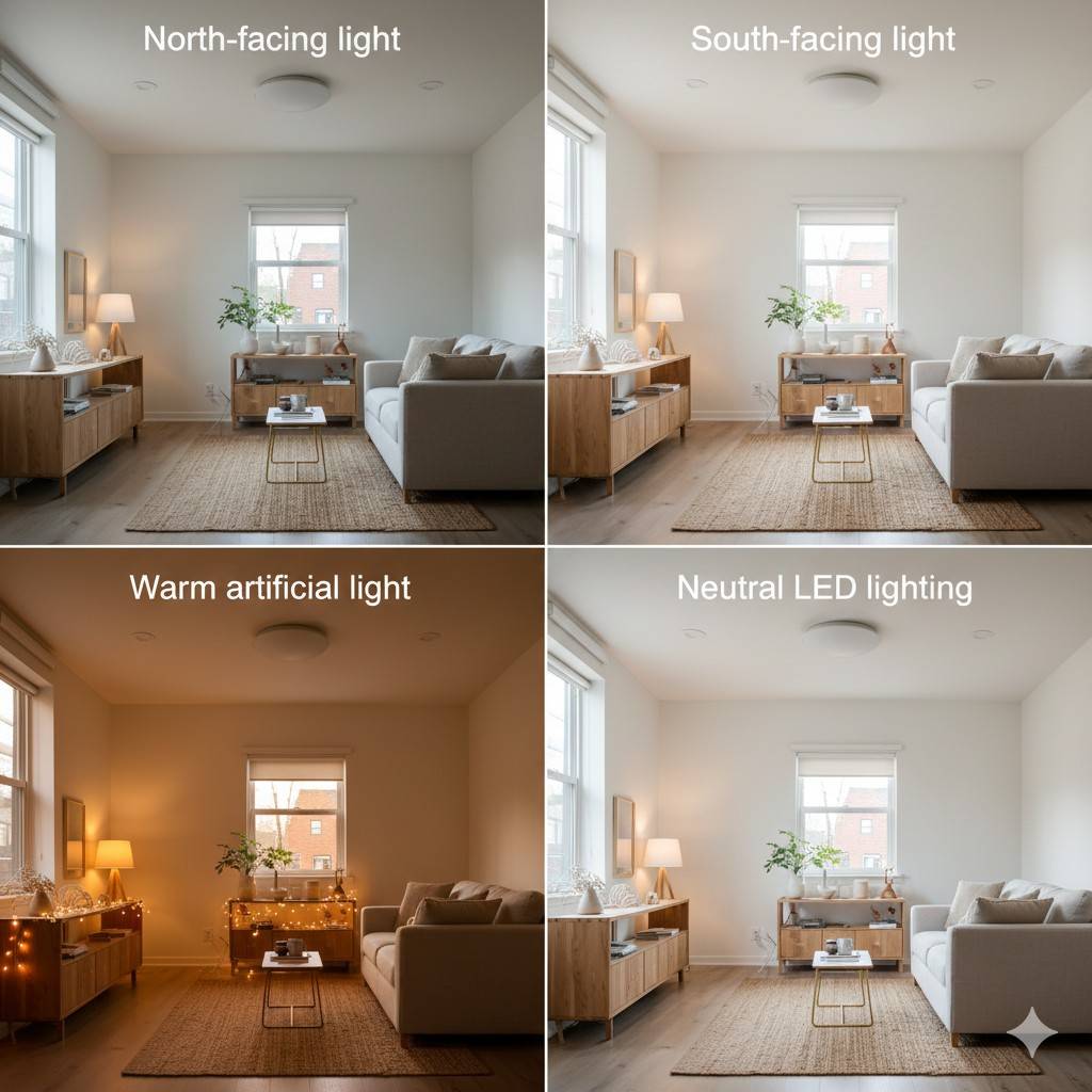
| Lighting Condition | How Swiss Coffee Appears |
|---|---|
| North-facing light | Warmer, creamier |
| South-facing light | Brighter, more neutral |
| Warm artificial light | Rich and cozy |
| Neutral LED lighting | Balanced and soft |
| Cool lighting | Slightly muted |
Sherwin Williams Swiss Coffee vs Benjamin Moore Swiss Coffee
One of the biggest sources of confusion around Swiss Coffee is that both Sherwin Williams and Benjamin Moore offer a color called Swiss Coffee, yet they are not identical. Homeowners often assume the names indicate the same shade, but in reality, each brand’s version has its own undertones, depth, and behavior in different lighting conditions.
Understanding the differences between Sherwin Williams Swiss Coffee and Benjamin Moore Swiss Coffee is essential, especially if you are trying to match an existing color, coordinate trim and walls, or repaint a space originally done with the other brand. While both are warm off-whites, the subtle distinctions can be noticeable once the paint is on the wall.
Are Sherwin Williams Swiss Coffee and Benjamin Moore Swiss Coffee the Same Color?
No, they are not the same color, even though they share the same name. Benjamin Moore Swiss Coffee is generally considered lighter and more neutral, while Sherwin Williams Swiss Coffee tends to be slightly warmer and creamier. This difference becomes more apparent in bright natural light or when the two are compared side by side.
Benjamin Moore Swiss Coffee often reads closer to a soft white with minimal warmth, making it a popular choice for homeowners who want warmth without visible creaminess. Sherwin Williams Swiss Coffee, on the other hand, has a bit more depth, which can feel cozier but also warmer in certain lighting conditions.
If you place samples of both colors next to each other, Sherwin Williams Swiss Coffee typically appears richer, while Benjamin Moore Swiss Coffee feels cleaner and brighter. These differences may seem minor, but across an entire room, they can significantly impact the overall look and feel.
Visual Differences Side by Side
When viewed side by side, the contrast between the two Swiss Coffees becomes clearer. Sherwin Williams Swiss Coffee has a noticeable creamy cast, especially in warm or low light. Benjamin Moore Swiss Coffee maintains a lighter appearance and is less likely to lean yellow.
In rooms with lots of natural light, Benjamin Moore Swiss Coffee often appears almost white, while Sherwin Williams Swiss Coffee still retains visible warmth. In darker spaces, the Sherwin Williams version can feel cozy, while the Benjamin Moore version may look slightly cooler or flatter.
This is why designers often choose:
- Sherwin Williams Swiss Coffee for traditional, farmhouse, or cozy interiors
- Benjamin Moore Swiss Coffee for modern, light-filled spaces
Which Swiss Coffee Is Warmer?
Between the two, Sherwin Williams Swiss Coffee is warmer. Its creamy undertones are more pronounced, especially under warm lighting or when paired with beige or wood-heavy finishes. Benjamin Moore Swiss Coffee has warmth as well, but it is more restrained and neutral by comparison.
If your home has warm wood floors, brass fixtures, or beige stone, Sherwin Williams Swiss Coffee tends to blend more naturally. If your home features cooler neutrals, gray accents, or modern finishes, Benjamin Moore Swiss Coffee may feel more balanced.
Choosing between the two ultimately comes down to lighting, surrounding materials, and personal preference. Sampling both in your space is the best way to determine which version works best for your home.
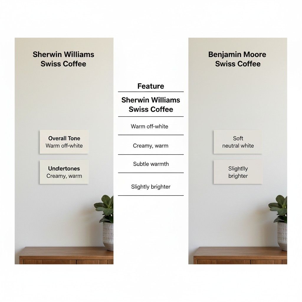
Swiss Coffee Brand Comparison Table
| Feature | Sherwin Williams Swiss Coffee | Benjamin Moore Swiss Coffee |
|---|---|---|
| Overall Tone | Warm off-white | Soft neutral white |
| Undertones | Creamy, warm | Subtle warmth |
| Brightness | Slightly deeper | Slightly brighter |
| Best For | Cozy, farmhouse, traditional | Modern, light-filled spaces |
| Lighting Sensitivity | High | Moderate |
Which One Should You Choose?
If you prefer a warmer, cozier look and your home has warm finishes, Sherwin Williams Swiss Coffee is often the better choice. If you want a lighter, cleaner off-white that stays neutral in bright spaces, Benjamin Moore Swiss Coffee may be the better option.
Either way, the key is testing both colors in your specific lighting conditions before making a final decision.
Sherwin Williams Equivalent to Swiss Coffee (Color Matching Guide)
Many homeowners search for a Sherwin Williams equivalent to Swiss Coffee because they love the look of Benjamin Moore Swiss Coffee but prefer Sherwin Williams paint lines, availability, or pricing. While Sherwin Williams Swiss Coffee is its own distinct color, it is not an exact match to Benjamin Moore’s version, which often leads to confusion during remodels and repaints.
Color matching across brands is possible, but it requires understanding how paint formulas, bases, and undertones differ. Even small variations can become noticeable once the paint is applied to large surfaces. That’s why knowing the closest Sherwin Williams alternatives—and when a custom match makes sense—is critical.
Best Sherwin Williams Match to Benjamin Moore Swiss Coffee
If your goal is to replicate the look of Benjamin Moore Swiss Coffee using Sherwin Williams paint, several colors come close, though none are perfect one-to-one matches. Sherwin Williams Swiss Coffee is warmer and creamier, while Benjamin Moore Swiss Coffee is slightly lighter and more neutral.
Some commonly recommended Sherwin Williams alternatives include:
- Alabaster (SW 7008) – Softer and less creamy, very popular
- Creamy (SW 7012) – Warmer and richer than Swiss Coffee
- White Duck (SW 7010) – Greige-leaning, subtle warmth
- Shoji White (SW 7042) – Balanced with a hint of gray
Among these, Alabaster is often the closest in overall feel, while White Duck works well when you want warmth without visible creaminess. Choosing the right match depends heavily on lighting and surrounding finishes, so samples are essential.
How Accurate Store Color Matching Really Is
Sherwin Williams stores can create custom color matches using digital scanning technology, but these matches are approximations, not exact duplicates. Paint formulas differ between brands, and the same pigment behaves differently depending on the base used.
Store-matched versions of Swiss Coffee often look very close in controlled lighting but can diverge once applied to walls. Factors like sheen, surface texture, and lighting will influence how accurate the match appears.
For the best results:
- Bring a painted sample board rather than a color chip
- Use the same sheen you plan to apply
- Test the matched color on multiple walls
If precision is critical—such as matching adjacent rooms or trim—custom matching can work well. For whole-home projects, choosing a native Sherwin Williams color with similar characteristics is often safer and more consistent.
When to Choose a Custom Color Match
A custom match is best when you are:
- Touching up existing Benjamin Moore Swiss Coffee walls
- Matching trim or cabinetry painted in another brand
- Maintaining consistency in a partially repainted home
However, if you’re starting fresh, choosing a Sherwin Williams color designed for their system usually delivers more predictable results. Swiss Coffee by Sherwin Williams may not be identical to Benjamin Moore Swiss Coffee, but it stands well on its own when used intentionally.
Swiss Coffee Matching Summary Table
| Goal | Best Approach |
|---|---|
| Match BM Swiss Coffee closely | Custom store match |
| Slightly warmer look | SW Swiss Coffee |
| Cleaner, softer white | SW Alabaster |
| Balanced warm-neutral | SW White Duck |
| Warm with gray influence | SW Shoji White |
Sherwin Williams Swiss Coffee vs Alabaster: Which One Is Better?
Choosing between Sherwin Williams Swiss Coffee and Sherwin Williams Alabaster can be surprisingly difficult. Both are warm off-white paint colors that designers frequently recommend, yet they behave very differently once applied to walls. Understanding the subtle differences between these two popular whites will help you avoid a costly repaint and ensure your space looks intentional rather than accidental.
While Swiss Coffee leans creamy and cozy, Alabaster offers a softer, cleaner warmth. The choice often comes down to lighting, surrounding finishes, and the mood you want to create in the room.
Undertones and Warmth Comparison
Swiss Coffee is noticeably warmer than Alabaster. It has cream and slight yellow undertones that become more visible in rooms with warm or artificial lighting. This makes Swiss Coffee ideal for traditional interiors, cozy living spaces, and homes with wood-heavy finishes.
Alabaster, on the other hand, has a neutral-warm base with very subtle beige undertones. It does not lean yellow, which is why it remains crisp without looking stark. In north-facing or low-light rooms, Alabaster holds its balance better than Swiss Coffee.
If you want a white that feels:
- Creamy and rich → Swiss Coffee
- Soft and balanced → Alabaster
Lighting Behavior in Real Homes
Lighting dramatically changes how these two whites appear. Swiss Coffee reflects warm light beautifully, but in overly bright spaces it can appear slightly yellow or creamy. This works well in homes with warm bulbs, wood floors, and beige or tan decor.
Alabaster adapts better across different lighting conditions. In bright natural light, it looks clean and airy. In dimmer rooms, it stays warm without turning muddy. This versatility is why Alabaster is often considered a “safe” white for open floor plans.
Key lighting takeaways:
- Swiss Coffee thrives in warm, cozy lighting
- Alabaster performs well in both natural and artificial light
- Cool LED lighting can exaggerate Swiss Coffee’s creaminess
Best Rooms for Each Color
Swiss Coffee is best used in rooms where warmth is a priority. It pairs beautifully with:
- Wood beams and trim
- Rustic or farmhouse kitchens
- Traditional dining rooms
- Bedrooms aiming for a soft, cozy feel
Alabaster works best in spaces that need flexibility and brightness, such as:
- Living rooms and open-concept areas
- Modern kitchens
- Hallways and entryways
- Homes with mixed warm and cool finishes
If you plan to use one white throughout the home, Alabaster usually provides more consistency.
Swiss Coffee vs Alabaster Comparison Table
| Feature | Swiss Coffee | Alabaster |
|---|---|---|
| Overall look | Creamy, warm | Soft, neutral-warm |
| Yellow undertones | Noticeable | Minimal |
| Best lighting | Warm, low to medium light | All lighting types |
| Design style | Traditional, cozy | Modern, transitional |
| Whole-house use | Limited | Excellent |
Which One Should You Choose?
Choose Swiss Coffee if your home leans traditional, features warm materials, and you want a cozy, inviting atmosphere. Choose Alabaster if you want a timeless, flexible white that works in almost any space without risk.
Both are beautiful, but the “better” option depends entirely on your lighting and design goals.
Swiss Coffee Color Palette & Coordinating Colors
Choosing the right color palette to complement Sherwin Williams Swiss Coffee is essential for creating a harmonious and visually appealing space. Swiss Coffee is a warm off-white with subtle creamy undertones, making it highly versatile. When paired with the right colors, it enhances the warmth and elegance of any room while maintaining a bright, airy feel.
Swiss Coffee works beautifully with a mix of neutrals, pastels, and bold accent colors. Its subtle warmth allows it to pair effortlessly with creams, beiges, grays, and even muted blues or greens. The goal is to create contrast without overpowering the soft, inviting nature of the base color.
Interior designers often recommend starting with three layers of color:
- Primary color (Swiss Coffee) – for walls or larger surfaces
- Secondary color – for trim, ceilings, or cabinetry
- Accent color – for furnishings, textiles, or decor
By carefully selecting secondary and accent colors, you can control the mood of the room—whether cozy and traditional or bright and modern.
Best Trim Colors to Pair with Swiss Coffee
Trim and molding colors are crucial for maintaining balance. Swiss Coffee can be paired with:
- Bright whites – for a clean, high-contrast trim look
- Alabaster – for subtle differentiation without stark contrast
- Soft gray tones – to add sophistication and modernity
The key is to create a slight contrast, so walls feel warm and inviting while trim remains crisp and defined.
Accent Colors That Work With Swiss Coffee
Accents allow Swiss Coffee to shine without feeling flat. Popular choices include:
- Deep navy – adds depth and richness
- Warm taupe or beige – enhances the creamy undertones
- Muted sage or olive green – creates a natural, earthy vibe
- Soft blush or peach – for a cozy, welcoming feel
- Charcoal or graphite gray – provides modern elegance
Accent colors can be used in throw pillows, rugs, curtains, or cabinetry to complete the palette.
Swiss Coffee Room Color Palette Table
| Palette Type | Colors | Use Case |
|---|---|---|
| Neutral | Swiss Coffee, Alabaster, Creamy | Living rooms, hallways, bedrooms |
| Warm | Swiss Coffee, Beige, Taupe | Kitchens, cozy living rooms |
| Cool Neutral | Swiss Coffee, Soft Gray, Charcoal | Modern interiors, offices |
| Earthy | Swiss Coffee, Sage Green, Warm Wood | Farmhouse, transitional spaces |
| Bold Contrast | Swiss Coffee, Navy, Graphite | Accent walls, furniture, decor |
Tips for Coordinating Colors
- Test paint samples together in the room under both natural and artificial light
- Use lighter secondary colors for trim to maintain contrast
- Introduce accent colors in small doses first (pillows, decor, small furniture)
- Consider flooring and cabinetry colors before finalizing wall paint
Swiss Coffee’s versatility allows it to harmonize with almost any color palette while providing a timeless base that will remain stylish for years.
Using Swiss Coffee Room by Room
Sherwin Williams Swiss Coffee is a versatile off-white that works beautifully throughout the home. Its subtle warmth allows it to adapt to different lighting, furnishings, and finishes, making it an excellent choice for walls, trim, ceilings, and even cabinets. However, the way Swiss Coffee performs can vary by room type, so planning your palette carefully is essential.
Living Room
The living room is often the largest and most visible space in your home. Swiss Coffee works exceptionally well here because it brightens the room while adding warmth. Pair it with natural wood furniture, warm metals, and soft textiles to create a welcoming environment.
Tips for the living room:
- Use Swiss Coffee on walls and trim for a cohesive look
- Layer textures like rugs, pillows, and curtains in complementary colors (soft taupe, muted navy, or warm gray)
- Add accent walls with slightly darker tones to create depth without overwhelming the space
Kitchen
Kitchens benefit from Swiss Coffee’s ability to complement cabinetry, countertops, and backsplash materials. Its creamy warmth is ideal for both modern and traditional kitchens.
Tips for the kitchen:
- Swiss Coffee walls work beautifully with white or wood-toned cabinets
- Use contrasting hardware (matte black or brushed brass) to create visual interest
- Bright lighting enhances the soft neutral tone, making the space feel clean and inviting
Bedroom
In bedrooms, Swiss Coffee promotes a cozy, restful atmosphere. It pairs well with warm woods, soft textiles, and natural fabrics.
Tips for the bedroom:
- Paint walls and trim Swiss Coffee for a uniform, serene palette
- Accent with muted greens, blushes, or soft blues in bedding or furniture
- Add natural light-blocking curtains in light neutral shades to enhance the creamy tone
Bathroom
Bathrooms often have bright lighting and reflective surfaces, which can make whites appear stark. Swiss Coffee is a great choice because it softens bright lights while maintaining a clean, fresh look.
Tips for the bathroom:
- Pair with white or cream tiles and warm metal fixtures
- Use Swiss Coffee on walls, keeping trim in a slightly brighter white for contrast
- Introduce natural textures, like bamboo or jute rugs, to enhance warmth
Hallways and Entryways
Swiss Coffee works well in transitional spaces because it flows smoothly between rooms, creating visual continuity.
Tips for hallways:
- Use the same Swiss Coffee color on walls and trim for a cohesive look
- Accent with framed art or mirrors to add personality without overpowering the space
- Consider durability—choose a satin or semi-gloss finish for high-traffic areas
Ceilings and Trim
Swiss Coffee can also be used on ceilings and trim for a warm, unified look. It adds subtle depth without making the ceiling feel too low, unlike bright whites that can feel stark.
Tips for ceilings and trim:
- Match ceiling paint with wall color for a seamless flow
- For trim, consider a slightly brighter white to provide contrast and definition
- Avoid overly glossy finishes that can highlight imperfections
Swiss Coffee Room-by-Room Summary Table
| Room | Recommended Use | Accent Colors / Finishes |
|---|---|---|
| Living Room | Walls, trim | Taupe, navy, gray, natural wood |
| Kitchen | Walls, cabinets | Warm wood, brass, matte black |
| Bedroom | Walls, trim | Soft blues, blush, muted green |
| Bathroom | Walls, trim | White/cream tiles, warm metals |
| Hallways/Entry | Walls, trim | Art, mirrors, neutral accents |
| Ceilings/Trim | Ceilings, moldings | Slightly brighter white, satin/semi-gloss |
Common Mistakes When Using Swiss Coffee
Swiss Coffee by Sherwin Williams is a beautiful and versatile warm off-white, but like any paint color, it can be tricky if not used thoughtfully. Many homeowners make mistakes that affect how the color appears in their space. Understanding these pitfalls ensures that Swiss Coffee enhances your home rather than creating unexpected results.
1. Ignoring Lighting Conditions
One of the most common mistakes is not considering the lighting in the room. Swiss Coffee behaves differently under natural versus artificial light, and north-facing or dimly lit rooms can make it appear warmer and creamier than anticipated.
Tips to avoid this mistake:
- Test paint samples in multiple locations within the room
- Observe samples in morning, afternoon, and evening light
- Adjust accent colors and furnishings based on the lighting response
Lighting influences how creamy or neutral Swiss Coffee appears, and skipping this step can lead to unexpected warmth or dullness.
2. Pairing With the Wrong Undertones
Swiss Coffee’s creamy undertones can clash with certain colors. Pairing it with cool grays or stark whites may create visual tension or make the walls feel off-balance.
Tips to avoid this mistake:
- Use warm or neutral accent colors to complement Swiss Coffee
- Avoid overly yellow, beige, or dark colors that exaggerate undertones
- Test small wall sections before committing to the full room
Understanding undertones is key for maintaining a harmonious color palette throughout your home.
3. Choosing the Wrong Sheen
Sheen can dramatically affect how Swiss Coffee looks. Matte finishes absorb light, making the color appear softer, while glossy finishes reflect light and can amplify undertones or imperfections.
Tips to avoid this mistake:
- Use satin or eggshell for walls to balance warmth and durability
- Semi-gloss or gloss works best for trim and moldings
- Avoid flat/matte finishes in high-traffic areas to reduce scuff visibility
Selecting the right sheen ensures Swiss Coffee performs beautifully in all rooms.
4. Using Swiss Coffee in Small or Dark Rooms Without Contrast
In small or poorly lit rooms, Swiss Coffee can feel heavy or overly warm if no contrasting colors are introduced.
Tips to avoid this mistake:
- Pair with lighter whites on trim or ceilings
- Add reflective surfaces like mirrors or glass to bounce light
- Use contrasting textures and finishes to prevent flatness
Contrast helps maintain brightness while keeping the space cozy.
5. Forgetting to Test Multiple Paint Lines
Different Sherwin Williams paint lines (Duration, Emerald, SuperPaint) may slightly alter Swiss Coffee’s appearance. Choosing the wrong line without testing can result in subtle variations that matter across large surfaces.
Tips to avoid this mistake:
- Always test the exact paint line you plan to use
- Paint small sample areas on walls instead of relying on swatches
- Observe color over a few days under different lighting
Consistency across rooms and surfaces is critical for whole-home applications.
Swiss Coffee Common Mistakes Table
| Mistake | Effect | How to Fix |
|---|---|---|
| Ignoring lighting | Appears too warm or dull | Test samples in multiple light conditions |
| Clashing undertones | Visual imbalance | Pair with warm/neutral colors |
| Wrong sheen | Shows imperfections or exaggerates warmth | Use satin/eggshell for walls, semi-gloss for trim |
| No contrast in dark rooms | Feels heavy or flat | Add lighter trim, mirrors, or textures |
| Not testing paint line | Slight color variation | Test the exact product on walls |
Frequently Asked Questions (FAQs) About Swiss Coffee
When it comes to Sherwin Williams Swiss Coffee, homeowners and designers often have similar questions about color behavior, application, and coordination. Answering these FAQs thoroughly can help you make informed decisions and avoid costly mistakes.
1. Is Swiss Coffee Warm or Cool?
Swiss Coffee is a warm off-white with subtle creamy undertones. It leans warmer than Alabaster or bright white colors. Its warmth is more pronounced in dim lighting or rooms with warm artificial lights, and softer in bright, sunlit spaces.
Tip: Test in your specific lighting before committing, especially if you prefer cooler whites.
2. Can Swiss Coffee Be Used for Cabinets?
Yes! Swiss Coffee is an excellent choice for cabinets, particularly in kitchens and bathrooms. Its creamy warmth complements wood, stone, and metal finishes.
Tips for cabinets:
- Choose a semi-gloss or satin finish for durability
- Pair with contrasting walls or backsplashes for dimension
- Test samples in natural and artificial lighting before painting large surfaces
3. How Does Swiss Coffee Compare to Alabaster?
Swiss Coffee is warmer and creamier, while Alabaster is softer and more neutral. Swiss Coffee works well in cozy, traditional spaces, while Alabaster excels in modern or open-concept layouts.
| Feature | Swiss Coffee | Alabaster |
|---|---|---|
| Undertones | Creamy, warm | Neutral-warm |
| Brightness | Slightly deeper | Lighter, softer |
| Best For | Traditional, cozy | Modern, transitional |
| Lighting Sensitivity | High | Moderate |
4. Can I Match Benjamin Moore Swiss Coffee with Sherwin Williams?
Yes, but they are not identical. Benjamin Moore Swiss Coffee is slightly lighter and more neutral. Sherwin Williams Swiss Coffee is warmer.
Matching tips:
- Consider Sherwin Williams alternatives like Alabaster, White Duck, or a custom match
- Test the sample in your room before committing
- Use the same paint line and sheen for consistency
5. What Colors Work Best with Swiss Coffee?
Swiss Coffee pairs beautifully with both warm and neutral tones, as well as muted accent colors.
Best pairings include:
- Warm neutrals: Beige, taupe, cream
- Cool neutrals: Soft gray, graphite
- Accent colors: Navy, sage, blush, muted green
- Metals: Brushed brass, bronze, matte black
Tip: Use accent colors in small doses through textiles, furniture, and decor.
6. Does Swiss Coffee Yellow Over Time?
Swiss Coffee is designed to remain stable, but its warm undertones may appear slightly more yellow in very dim or warm-lit rooms. Regular cleaning and proper ventilation help maintain the color’s appearance.
7. Is Swiss Coffee Good for Whole-Home Painting?
Yes, Swiss Coffee can be used throughout a home, but consider variations in lighting. North-facing rooms may appear warmer, and south-facing rooms may read more neutral.
Tip: Use slightly brighter whites for trim or ceilings to maintain contrast.
Swiss Coffee FAQs Summary Table
| Question | Answer |
|---|---|
| Warm or cool? | Warm, creamy undertones |
| Cabinets? | Yes, use satin/semi-gloss |
| Compare to Alabaster? | Warmer and creamier |
| Match BM Swiss Coffee? | Possible with SW alternatives or custom match |
| Best coordinating colors? | Neutrals, muted accents, warm metals |
| Yellow over time? | Slightly in dim/warm light; proper ventilation helps |
| Whole-home use? | Yes, adjust for lighting and contrast |
See also Balanced Beige vs Accessible Beige
Final Tips & Expert Recommendations for Using Swiss Coffee
Sherwin Williams Swiss Coffee is one of the most versatile and popular warm off-whites available today. Its creamy undertones allow it to blend seamlessly with a variety of décor styles, lighting conditions, and materials. However, to maximize its beauty and longevity, it’s important to follow a few expert recommendations.
1. Test Samples Before Committing
Even subtle variations in lighting, flooring, and furniture can affect how Swiss Coffee appears. Experts recommend painting sample sections on multiple walls before committing to a full room or home. Observe how the color looks in:
- Morning light
- Afternoon light
- Evening artificial light
This ensures your Swiss Coffee walls will maintain the desired warmth and tone throughout the day.
2. Consider Trim and Ceiling Colors
For a polished look, coordinate Swiss Coffee with trim and ceiling colors. Most designers suggest:
- Using slightly brighter whites on trim to create subtle contrast
- Keeping ceilings either the same color or one shade lighter to maintain flow
- Matching cabinet colors carefully if used in kitchens or bathrooms
Proper coordination prevents Swiss Coffee from looking flat or overwhelming.
3. Pair with Complementary Colors
Swiss Coffee works beautifully with both warm and cool accents, but careful pairing can elevate your interior design. Recommended pairings include:
- Warm tones: Beige, taupe, soft wood
- Cool neutrals: Gray, graphite, soft greige
- Accent colors: Navy, muted green, blush, soft blue
- Metal finishes: Brushed brass, bronze, matte black
These combinations create depth, contrast, and visual interest while preserving the color’s soft warmth.
4. Choose the Right Sheen
The sheen affects both appearance and durability. For best results:
- Walls: Satin or eggshell finish – smooth, durable, and elegant
- Trim and moldings: Semi-gloss – easy to clean and slightly reflective
- Cabinets: Semi-gloss or gloss – resists stains and enhances richness
Choosing the right finish ensures Swiss Coffee maintains consistency and elegance in all spaces.
5. Avoid Common Pitfalls
Even experts advise being cautious about these mistakes:
- Using Swiss Coffee in rooms with very yellow lighting without testing
- Pairing with clashing undertones like cool grays or stark whites
- Applying without considering adjacent flooring and furniture tones
A thoughtful approach ensures Swiss Coffee looks intentional and timeless.
6. Expert Recommendation for Whole-Home Painting
Swiss Coffee can be used throughout the home, but experts recommend:
- Using slightly brighter whites or soft neutrals for high-contrast trim
- Testing in each room individually for lighting variations
- Coordinating furniture, accents, and flooring before full application
This approach creates a seamless, warm, and elegant feel across your home.
Swiss Coffee Expert Tips Summary Table
| Tip | Expert Recommendation |
|---|---|
| Sample first | Paint small wall sections in all lighting conditions |
| Trim & ceiling | Slightly brighter whites for contrast |
| Complementary colors | Warm neutrals, soft grays, navy, muted greens |
| Sheen choice | Satin/eggshell for walls, semi-gloss for trim/cabinets |
| Avoid mistakes | Test lighting, match undertones, coordinate finishes |
| Whole-home application | Adjust for room-specific lighting & accents |
Conclusion & Key Takeaways for Swiss Coffee Sherwin Williams
Sherwin Williams Swiss Coffee is more than just a warm off-white; it’s a versatile, elegant choice that can transform any space. From living rooms and kitchens to bedrooms and bathrooms, Swiss Coffee provides a cozy, inviting atmosphere while remaining neutral enough to pair with virtually any accent color, trim, or material.
By understanding lighting, undertones, complementary colors, and finish options, you can ensure that Swiss Coffee enhances your home rather than creating unexpected results. Its adaptability makes it ideal for both traditional and modern interiors, and with careful planning, it can be used consistently throughout an entire home for a cohesive look.
Key Takeaways
- Warm and Versatile: Swiss Coffee is a creamy, warm off-white that works in multiple spaces.
- Lighting Matters: The color shifts subtly under natural and artificial light, so testing in each room is critical.
- Trim and Ceiling Coordination: Slightly brighter whites for trim and ceilings create subtle contrast and elegance.
- Pairing Colors: Warm neutrals, muted grays, navy, blush, and sage green complement Swiss Coffee beautifully.
- Sheen Selection: Satin or eggshell for walls, semi-gloss for trim or cabinets, ensures durability and visual appeal.
- Room-Specific Applications: Swiss Coffee works best in cozy bedrooms, welcoming living areas, bright kitchens, and versatile hallways.
- Brand Comparisons: Sherwin Williams Swiss Coffee is warmer than Benjamin Moore’s Swiss Coffee and differs slightly from Alabaster.
- Avoid Common Mistakes: Test lighting, match undertones, and plan accents to prevent color mishaps.
Final Thoughts
Swiss Coffee offers a timeless, adaptable solution for homeowners seeking a warm and inviting aesthetic. With careful planning, testing, and coordination, it can enhance your home’s beauty while providing a soft, elegant backdrop for your furniture, decor, and finishes. Whether you’re refreshing a single room or completing a whole-home repaint, Swiss Coffee remains a reliable and stylish choice for creating warmth and sophistication.
See also Can You Use Pine-Sol on Wood Floors
Quick Swiss Coffee Cheat Sheet
| Feature | Swiss Coffee Notes |
|---|---|
| Tone | Warm off-white with creamy undertones |
| Best Lighting | Adapts well to most lighting, test in each room |
| Best Sheen | Satin/eggshell for walls, semi-gloss for trim/cabinets |
| Complementary Colors | Beige, taupe, soft gray, navy, blush, muted green |
| Room Suitability | Living room, kitchen, bedroom, bathroom, hallways |
| Brand Comparison | Warmer than BM Swiss Coffee, creamier than Alabaster |
| Common Pitfalls | Ignoring lighting, mismatched undertones, wrong sheen |